How do you make online maps accessible so everyone has easy access to the same information?
Front-End Developer, Kandice Stern, talks about the challenges and benefits of coding digital maps for accessibility.
Everyone has a right to public information – the way it’s provided could save lives
We should all be able to get publicly available information equally easily whether we read it, listen to it, have the text converted into braille or another language, detect notifications using haptic feedback (vibrations), or navigate around a web page using a trackpad, touchscreen, keyboard or other device. This diversity of options are all a part of what we mean when we talk about accessibility.
Accessibility of information was a major requirement of our work for Victoria’s Department of Transport and Planning’s (DTP) VicTraffic progressive web application.
VicTraffic is an important web-based tool for Victorians who need reliable information about whether roads are open or closed to plan their everyday travels and quickly identify suitable routes in emergency situations.
VicTraffic displays interactive maps and summarises lists of any Victorian, South Australian and New South Wales roads that are affected by roadworks, floods, fires, crashes or other issues that cause disruptions to normal traffic flows.
People with disabilities particularly need clear information during disasters or other events that close roads or disrupt traffic. If digital content isn’t presented with consideration for a screen reader, for example, someone listening to a page might hear 50 or 60 meaningless words before getting the information they need. This makes a website or app unusable for that person.
Prioritising the needs of people with disabilities makes software better for everyone
Our work on the new VicTraffic web app prioritised accessibility for people with disabilities to ensure that those who rely on a single method of communication get what they need, while people who can consume information in several ways have a range of options.
When software is coded for accessibility, features on modern digital devices enable people to move through their day while getting essential information the way they want it: listening, reading, getting notifications, and navigating through screens using keyboards, a mouse, fingertips or other pointing device.
What are the challenges of making digital maps accessible?
How do we ensure that something so inherently visual as a digital map can also be used and understood by people who may have impaired vision or no vision at all – those who rely on assistive technology like screen magnifiers, screen readers or Braille translators?
How do we enable users to manipulate and navigate an online map using a keyboard, rather than assuming everyone will use a mouse or fingertips to click, zoom or pan?
Some of the specific challenges developers face when creating accessible maps are:
context:
how do we ensure the user knows what part of a map is displayed, particularly if they can’t view information on a screen?
navigation:
how can users pan/move around on a map – can they navigate with a keyboard rather than a mouse?
how can users select a key piece of information such as a closed road if they want more details?
speed of access to information using different methods
how quickly key information can be comprehended when viewing a map, or looking at a list or hearing web page contents read aloud or translated by a Braille device.
the number of clicks or steps required to find additional information
the ability to customise and save common searches or areas of interest
One major focus for VicTraffic was to develop sufficient text-based alternatives for every piece of relevant visual information.
These are some of the accessibility functions we included in VicTraffic
We made considered design decisions in the VicTraffic progressive web app to maximise comprehension by all road users in emergency situations.
We created a PWA for VicTraffic to display the status of roads in Victoria, NSW and South Australia
To best understand the positive impact of PWA’s, let’s have a look at the VicTraffic Replatform project that Symbiote successfully launched in 2024 in conjunction with VicRoads.

Image 1: The VicTraffic progressive web app provides users with several ways to search for and identify road disruption or closures. Users can interact with the map area on the right to pan, zoom or investigate disruptions that are summarised with symbols. The area can also be defined using the Search tool. All road disruptions within the selected map area appear in the List pane on the left. This provides summary information, with more detailed information available when items are selected.
Intuitive search function
While not specifically an accessibility function, the customised search tool you can see in Image 1 is an intuitive search tool that allows users to type in areas they’re interested in, rather than interacting with the map. As users type in the search box they’re alerted as potential locations are suggested. This is an alternative method for users to quickly see a list of relevant road disruptions or refine the area of focus on the map.
Status messages are prioritised at the top of the List panel
Presenting road disruption information in a list, as shown in Image 2, reduces the mental effort involved in interpreting the icons on the map.
This list uses markup so people relying on screen readers hear emergency notifications as soon as they’re issued. They will also hear the number of notifications available in the selected map area, so they can decide whether to reduce the search area before reading disruption details from the list panel.
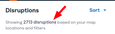
Image 2: The Disruptions status message lists the number of road disruptions based on the selected map area and filters. This can be read aloud by a screen reader.
Design decisions were made to maximise comprehension
Symbols, font sizes and colour palettes were selected for easy comprehension and maximum readability.
Links and action buttons were designed so they’re readily identifiable and they inform users of the action to be triggered.
Information is displayed using icons and text
Icons show at a glance if there’s any disruption to traffic on a given road, what the problem is and whether it’s open or closed. For example, the snowflake icon shown in Image 3 below represents a seasonal closure.
Icon information is also represented textually so it can be read by sighted users or people using a screen reader.

Image 3: Clear icons show the reason for disruptions to traffic. Text provides the same information for sighted people or people who use screen readers.
Keyboard navigation is an alternative to using a mouse
VicTraffic maps can be navigated using a keyboard, so users can zoom in/out and pan without using a mouse; these controls are announced via a screen reader but the map itself is NOT (other than announcing ‘map region’). Screen reader users can change the map area and then hear about the corresponding disruptions by listening to information read from the list panel.
Coding for accessibility improves software for all users
All the accessibility features we added to make the VicTraffic web app work for someone with a disability also improve it for non-disabled people.
Presenting information in different ways ensures everyone receives critical data in an emergency. It also benefits people when they’re distracted, they’re using different devices, they don’t understand written English, or they have a temporary or permanent condition or disability that makes it difficult or impossible to read or comprehend images or text on a screen.
As a developer, I find it satisfying to puzzle out ways to make digital maps and other software accessible so people can get information equally easily whether they read it, listen to it, have the text converted into Braille or another language, detect notifications using haptic feedback, or they navigate around the page using fingers, a keyboard or other device.
While much of this technology is available via accessibility features on the devices most of us carry around every day, not all software is coded in a way that allows us to effectively use these accessibility features.
I encourage you to explore and use the accessibility features on your devices because the more we use them, the more demand we create for all software to be developed in accessible ways. This benefits people with and without disabilities.
Read the case study …
