Open source code is part of a sustainable circular design economy
In our work with Circular Open, an offshoot of Melbourne Design Week, we amplified their conversations about sustainability in design by selecting an easy-to-use CMS and writing reusable open source code.
Image 1: The Circular Open website displayed on a desktop and mobile device.
The challenge
‘We want a website that’ll connect, share and showcase the event and the work of top Australian designers. It needs to be clean, modern, accessible and user-friendly, especially for people using mobile devices. An open source website is as important to us as our exhibition event.’
That’s the brief we received from our clients, E tu E tu and Ulla-Britta Westergren, who developed the Circular Open Design website to promote the By-Product group exhibition event as part of Melbourne’s 2021 Design Week.
“Our focus was on sustainability and the urgent need to work towards a Circular Economy in Melbourne’s design community. We wanted to demonstrate the power of community and knowledge sharing by creating an open-source resource of instructional guides that inspired others to make from waste. We engaged Symbiote to create an open-source website we could use to promote our event and share information. The code for the website itself would also be shared.”
We loved this project proposal with its strong focus on circular design, repurposing and knowledge sharing as a way to build design resilience, and felt the reusable nature of everything that we’d build for this website would be well suited to the brief. One of our underlying company values is sustainability and the ethical use of resources, and we’ve always been heavily involved in open-source web design, which relies on the efficient use and re-use of code.
The website needed to help our clients achieve their objectives for the event, which were to:
Promote the exhibition event and enable ticket sales and social media sharing
Provide an opportunity for participating designers to be introduced to NGV curators and collectors for potential networking, commissions and future exhibits.
Create an open and inclusive space for conversations on sustainability and the urgent need to work towards a Circular Economy in Melbourne’s design community.
Demonstrate the power of community and knowledge sharing by creating an open-source library of instructional guides inspiring others to make from waste.
Provide an opportunity for Melbourne designers to come together and showcase their objects made from waste and provide a platform for their design to be purchased.
Support the community by donating auction profits 50/50 to participating designers and charity.
The website also had to tick these boxes:
Modern design
Created on an open source platform
Simple authoring for ease of use
Mobile-first design
Use accessibility best practices.
Image 2. Image on left is a lo-fidelity sketch of a wireframe. Image on right is the high-fidelity design created in PyroCMS.
What we did
We began with a CMS Audit to find the best open source CMS for this project.
CMS considerations included:
Ease of use for content authors
aesthetics of page editing tool
ability to find and create pages
ability to create content, links, attach images etc.
Accessibility plugins
Number of steps for getting started for a developer
Availability of off-the-shelf modules
How configuration would be managed.
“We decided to build the site using the Larvel-based PyroCMS, because it’s easy to use but powerful, fully open-source and would give us a working website anyone could re-use to build their own site.”
The client provided the branding and identity assets and a style guide. They had a specific request to bring animation into the logo as they wanted the arrow to represent ‘circularity’.
We used laser-focussed co-design sessions to quickly gather all the information about what success looked like for this project.
The proposed design was tested by the client stepping through all the features using a lo-fi wireframe of the site.
Image 3: The client provided a static PNG logo, requesting that the arrow circulate in the website hero section to represent ‘circularity’.
This video demonstrates the animated logo we built for the client, using custom CSS as a way to represent 'circularity'.
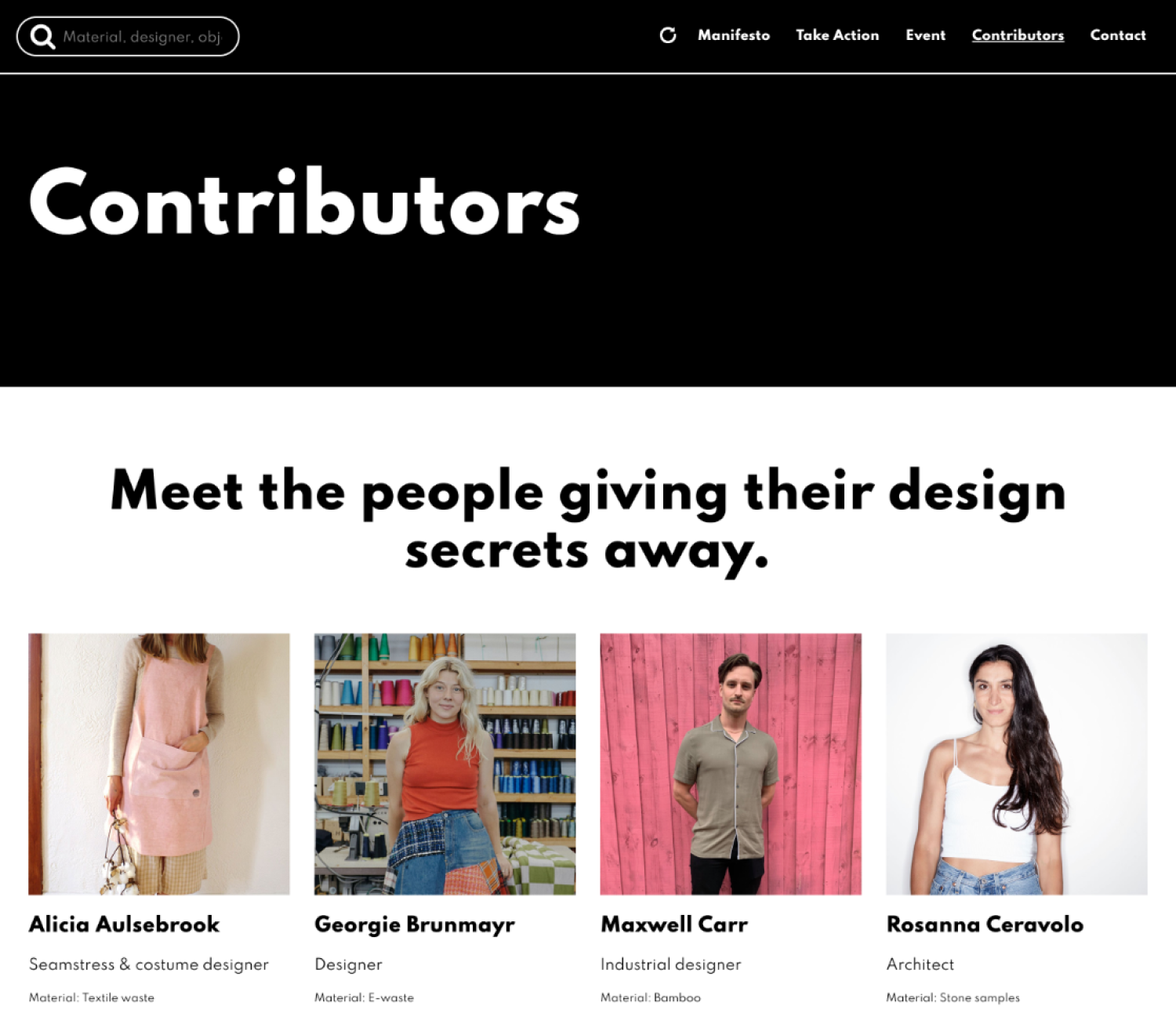
Image 4: A screenshot of the Contributor landing page. This page linked to Contributor profiles where visitors could access photos, process videos, contact information and URL links to access the designers’ open-source creations.
The result
The resulting Circular Open website was produced and launched in two months and it worked on all levels.
It was beautifully designed, easy to use, written in open source code and made available for people to re-use.
Importantly, this work enabled us to be part of discussions about sustainability and open source principles.
We’re serious about lowering our, and our clients’, environmental footprint in as many ways as possible – code is our material and sharing code is one small step in that direction.
“The site looked beautiful and helped us meet all our goals. We had 1,200 visitors to the site, more than 300 registrations for our event and managed to raise over $5,000 for charity. We were delighted to get a visually rich site that supported the story we were telling. Imagery by The Design File’s Sean Fennessy, combined with the website’s minimal aesthetic and simple navigation, made the site beautiful and easy for visitors to navigate. The website was easy to update and add content to – there was a minimal learning curve and we had all the support we needed to get it up and running.”


