Connecting grantseekers and philanthropists using personal, small-scale user research
Personal user research with grant seekers enabled the Ian Potter Foundation to tailor their website to simplify the process of finding and applying for grants
Image 1: The Ian Potter Foundation website supports grantseekers to navigate, understand and confidently apply for grants.
The challenge
The Ian Potter Foundation (IPF) came to us with two challenges:
To better understand their website content’s performance.
To develop a deep understanding of the needs of their site’s end users by identifying their key motivations, objectives and pain points.
Ian Potter Foundation is one of Australia’s oldest not-for-profit, philanthropic foundations supporting purpose-driven projects across the country in science, health, arts and culture.
Every year thousands of hopeful grantseekers submit grant applications to IPF, which are reviewed internally and approved by committee members. Grantseekers often find it difficult and time-consuming to find critical grant objectives and eligibility information when applying for philanthropic grants. Administrative staff spend considerable amounts of time answering questions about grants and assessing applications.
IPF sought our help to understand how to optimise their online information and processes to give grantseekers the best chance of success by matching them with appropriate funding applications and providing all the information they need to submit a high quality application.
What we did
Our user experience (UX) analysis began with onsite listening sessions and workshops with staff at IPF and one-on-one interviews with grantseekers.
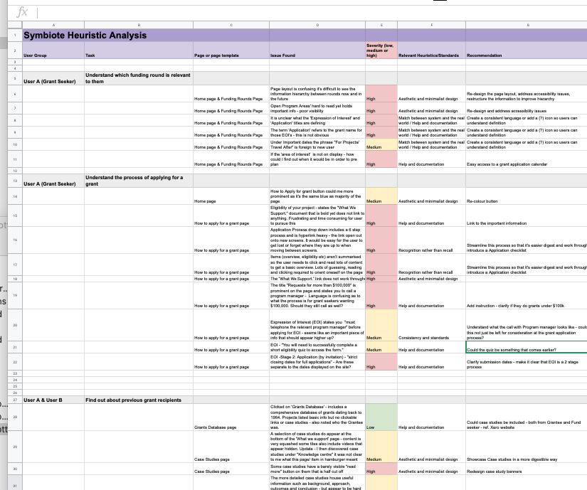
We developed a series of user journey maps before we completed a structured content audit (heuristic analysis) on this client’s website to identify what was and wasn’t working. Once we understood how the site performed and the features users wanted, we identified opportunities for improvement. These were categorised into high, medium and low priority tasks – as shown in Image 2 – to make it easier for IPF to focus their efforts in line with their strategic direction.
Image 2: A spreadsheet outlining the heuristic analysis conducted as part of the UX engagement, identifying problem areas as low, medium and high, informing the opportunities outlined in the UX Recommendations Report.
“We take a human-centred approach to user research, which means we talk to the right people to understand what they want to do and where they struggle. We spend time building trust and asking deeper questions of small groups of people. This more intimate approach means we get detailed answers to our questions, along with invaluable extra information that wouldn’t be offered using impersonal, large-scale user research methods.”
The result
We produced a high level UX Recommendation Report outlining the key insights gathered during the discovery phase, which included user feedback gathered in a workshop with IPF staff and listening sessions with current grantseekers. The report also included a content review (heuristic analysis) to identify areas of the website that were underperforming or difficult to understand.
The IPF digital team were able to use the detailed list of UX recommendations and tangible next steps from the report to identify the tasks that would improve the end users’ experience and enable grantseekers to self-qualify, reducing the volume of support-related enquiries.
The report was a valuable resource for the IPF digital team, as it was used to support future planning and strategy discussions relating to website improvements with the IPF board.
“One key takeaway from the user research was that various grant providers use common terms differently, which creates confusion for grantseekers. Before we did this work, grantseekers often needed to call IPF staff and clarify their understanding, which took up everyone’s time and energy. We discovered that grantseekers appreciated a well-organised, time-saving site that gave them unambiguous information so they could find and apply for the grants that suited them best.”


