This elegant open source website remains flexible for the future
NOPSEMA wanted a light brand refresh and a modern sub-website they could maintain themselves. The specs: open source software, a small budget and a tight timeframe.
The challenge
Our client, The National Offshore Petroleum Safety and Environmental Management Authority (NOPSEMA) came to us with a sub-website that was last updated in 2013. The site represents their regulatory arm – the International Offshore Petroleum Environment Regulators (IOPER). It was dated and functioned as an online brochure rather than a functional website.
There was some urgency to the website upgrade. When they engaged us, IOPER were soon to host an international conference. They needed a modern website that reflected their brand, was simple to use and easy to maintain – and they needed it quickly.
“The client felt that their original site didn’t represent the quality and prestige of the work done by the group’s members.”
What we did
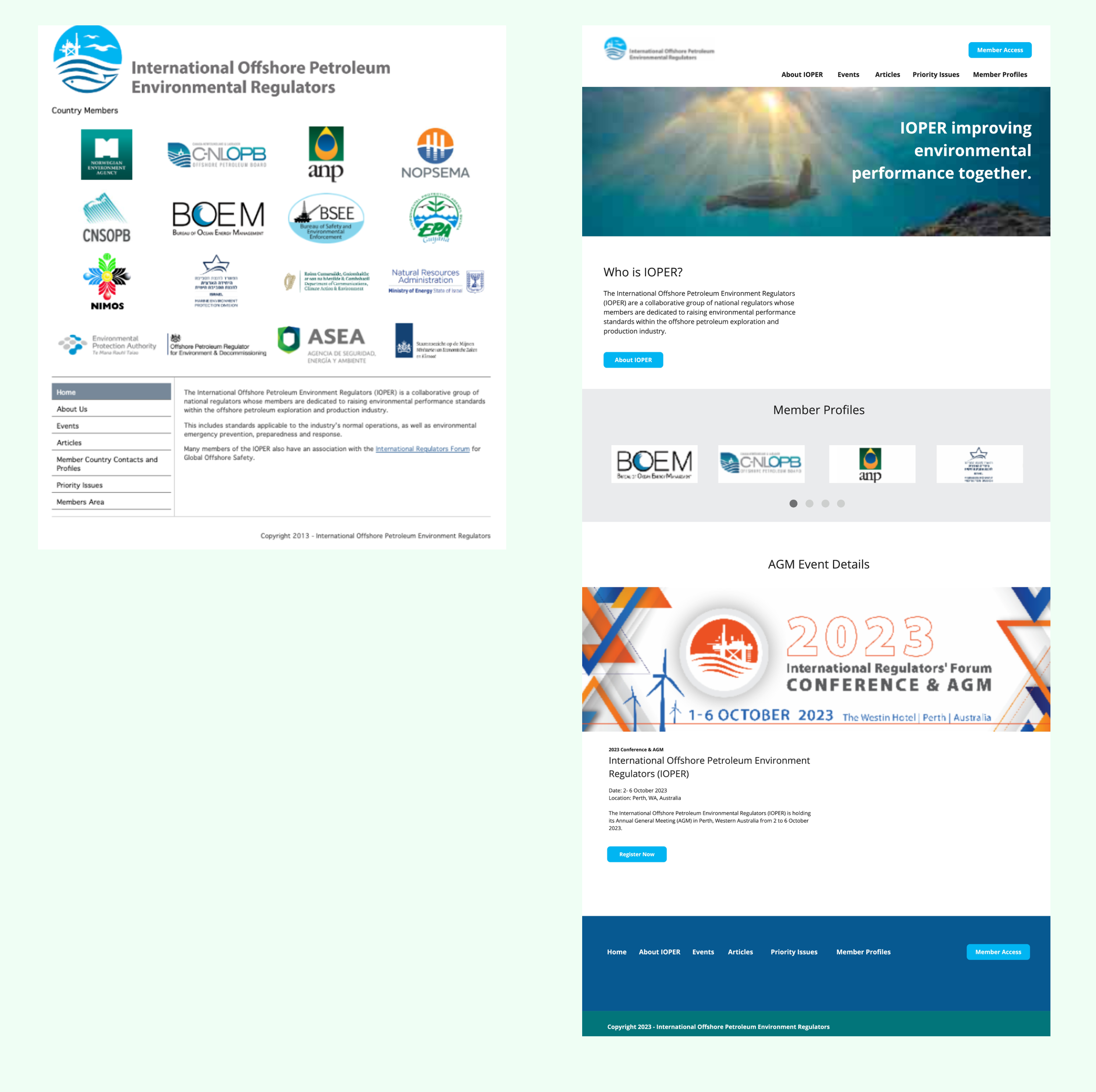
We designed IOPER’s new website using Silverstripe open source software and an out-of-the-box template that Symbiote’s software developers customised based on the wireframe designs. The result was a simple, professional-looking website that allowed staff to easily add and update content. It also recorded analytics showing how the site was being used.
Image 1: Website before (left) and after (right) images of the IOPER homepage.
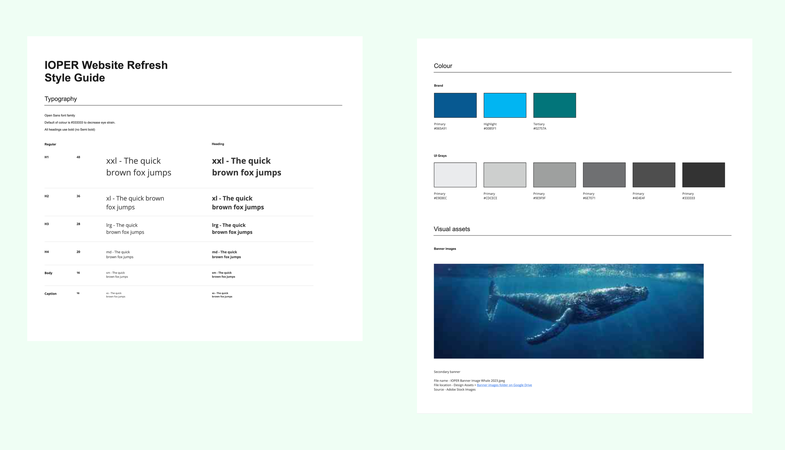
Rather than doing a full rebrand, we refreshed IOPER’s brand identity by streamlining their colour palette in line with their current logo, applying a new font and font hierarchy and introducing imagery that supported their brand story. As part of the brief, all design assets had to be open-source with no hidden licensing fees. This ensured the solution would be cost effective for the years to come.
Image 2: Style guide created for IOPER website refresh.
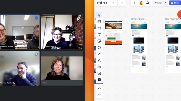
We chose Miro as the design tool of choice for this project to keep things Lean, work fast and avoid overworking the designs. Miro is an online whiteboard tool that enables people to collaborate, design and innovate by enabling users to communicate visually with words, diagrams, sketches, screenshots or links.
“Designing in Miro was a strategic decision that radically simplified the design process and reduced the decision-making load as it has limited tools and features compared to a tool like Figma. Our Design to Dev Hand Off meeting ensured all questions were answered so that Kandice, our front-end developer had all the information she needed to develop the site.”
Image 3: Symbiote project team collaborating in Miro.
We arranged IOPER’s existing content on interactive pages to make it look more modern and appealing.
Once the approved colour palette, fonts and images were applied to the user-friendly website templates, the client was able to log in and easily create content.
The other simple but powerful change we made was to connect Google Analytics to the site.
The result
The user-friendly new site began earning its way immediately, with conference organisers posting ticket registration links, event details and custom event banners on the site.
The use of Miro as a design tool significantly sped up the design process. Rather than the design team creating detailed designs using sophisticated visual design tools, and using different tools to communicate and get feedback, they did everything in Miro: rapidly creating colour palettes and designs, getting feedback from clients and then giving developers modern wireframes they could use to create templates for the website.
Keeping the collaboration and design process as simple as possible reduced any barriers to communication. Indeed, there were only two rounds of client feedback before the wireframe designs were approved and implemented.
Our client had a minimal learning curve with the highly intuitive open source website, which has been tested and used over a long period by millions of developers and users.
Thanks to the simplicity of the templates we’d pre-populated with their new brand colours, images and new font and font heirarchy, the NOPSEMA staff can now quickly and easily create great-looking new content or pages.
The client can use Google Analytics to reveal useful data about who visits their site, how long they spend there, where they come from, what they look at etc, so they can make informed decisions if they ever want to change the site.
“Thanks to our familiarity with Silverstripe and our streamlined codesign process we were able to create a lovely, simple site for NOPSEMA in 40 development hours, with just two rounds of client revisions. They only needed 35 minutes of tuition before they were off and running using their new site to promote and administer their conference.”


